Shared Revenue Dashboards for Sales and Marketing Teams
Both teams need shared definitions and a single data source before building any dashboard.

A shared revenue dashboard is not a marketing report with a sales column added. It is certainly not a CRM pipeline view with a campaign tab bolted on. Both of those get presented as alignment solutions, regularly, and they solve nothing. A genuinely shared dashboard traces the full journey from first touch to closed deal in one view, owned by both teams, built on definitions both teams agreed to before the first chart was drawn.
The defining characteristic is closed-loop reporting. Sales outcome data flows back to marketing; marketing engagement data is visible to sales reps before they pick up the phone. When a deal closes, marketing can see which campaign originally sourced that customer. When a rep opens a lead record, they can see every touchpoint that contact engaged with before entering the pipeline. Without that bidirectional flow, the dashboard is a display, not a system — like a speedometer with no engine underneath it.
There is also a distinction that gets glossed over: operational dashboards versus strategic ones. Operational dashboards run in real time or near real time, monitoring conditions that demand immediate action, like live inbound lead volume or campaign spend pacing against budget. Strategic dashboards aggregate longer-horizon data for planning, using trend lines and comparative benchmarks rather than live feeds. A complete shared revenue dashboard needs both layers. The one to open in a Monday morning pipeline review is not the one to open in a quarterly planning session, and building one undifferentiated report for both purposes is one of the more reliable ways to end up with a dashboard nobody opens.
What a shared revenue dashboard is not: a BI report nobody requested, a dashboard one team built for its own review with the other team granted read access, or a slide deck exported from two separate tools and merged in a presentation. Each arrangement preserves the silo while creating the appearance of solving it. Displayed-side-by-side data will produce conflicting numbers within a quarter. Conflicting numbers collapse whatever trust made the exercise feel worthwhile.
The Data Architecture That Has to Exist Before Any Dashboard Is Built
The most common failure mode is investing in dashboard tooling before fixing the underlying data. Teams spend months on visualization layers while the foundation underneath is fractured. The tool gets purchased, the charts get built, the numbers don't match what either team sees in their own systems, and the whole thing quietly dies. The sequence is wrong in most organizations. The foundation is an afterthought.
Three things have to be in place before a single chart is configured.
First: a single system of record. All lead, contact, opportunity, and account data must live in one CRM. Not synchronized across two systems, not mirrored nightly, not exported into a shared spreadsheet that someone updates manually on Fridays. Synchronization creates latency. Mirroring creates version conflicts. Spreadsheets create audit trails nobody maintains. One system.
Second: shared entity definitions at the technical level. The same contact, account, and opportunity IDs must mean the same thing across every tool in the stack. If a contact record in the marketing automation platform carries a different ID than the same person's record in the CRM, attribution breaks, conversion tracking breaks, and the dashboard becomes unreliable in ways that are slow and genuinely painful to diagnose.
Third: integrated platforms. Tool integration is a revenue decision, not an IT one. The CFO should care about this as much as the CTO, because the cost of data inconsistency shows up in forecast misses and misdirected budget, not just in engineering tickets.
The shared language problem deserves direct attention. If "qualified lead" means different things to marketing and sales, then the MQL-to-SQL conversion rate in the dashboard is measuring definitional inconsistency, not actual lead quality. Every pipeline review becomes an argument about whose numbers are right. Both sides bring evidence, both sides are correct relative to their own definitions, nothing gets resolved, and the next meeting starts exactly the same way. The real disagreement is not about the numbers. It is about whose version of reality counts. You could say the teams are speaking the same language and understanding completely different things — which is just a definition problem wearing a data problem's clothes.
Document agreed definitions for every term that will appear in the dashboard: MQL, SQL, pipeline contribution, influenced revenue. Do this before a single chart is built, and do it jointly. Not a marketing decision that sales reviews afterward. Not a sales decision that marketing accepts under protest. Joint ownership of the definitions is what makes the dashboard a shared artifact rather than a contested one.
The Six Metrics That Belong on Every Shared Revenue Dashboard
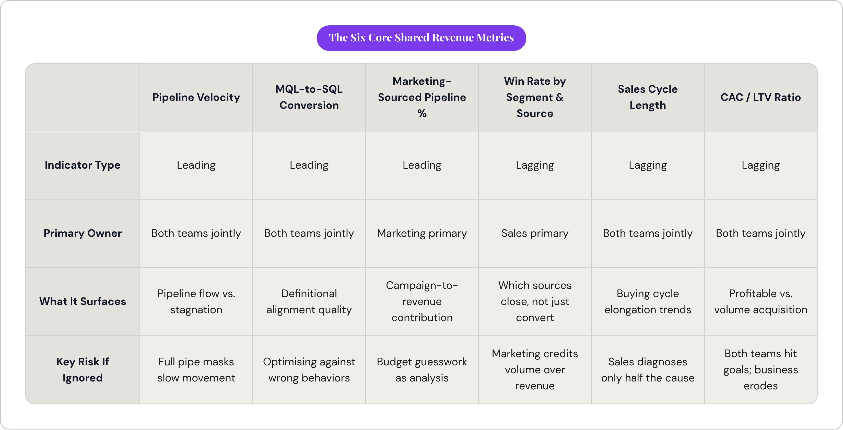
The framework for selecting metrics comes down to one distinction: leading indicators carry forward visibility of roughly two to six weeks; lagging indicators reflect outcomes already realized. An effective shared dashboard carries both, weighted toward roughly two or three leading indicators for every lagging one. That ratio ensures the dashboard surfaces cause-and-effect relationships rather than a rearview mirror of outcomes nobody can change.
Pipeline Velocity
Pipeline velocity is a leading indicator and the most diagnostically useful alignment metric on this list. The formula: number of opportunities multiplied by win rate and average deal size, divided by sales cycle length in days. Marketing influences the number and quality of opportunities entering the pipe. Sales influences win rate and cycle length. Neither team can move this number alone, and that interdependency is precisely what makes it the right shared metric. When velocity drops, both teams have to diagnose it together.
Most teams still track pipeline value, a stock measurement, rather than pipeline velocity, a flow. A full pipeline that moves slowly is a very different problem than a full pipeline that converts, and a single dollar figure will not tell you which situation you are in.
MQL-to-SQL Conversion Rate
This is the most direct measure of marketing-sales alignment. It tells you whether marketing is sending the right leads and whether sales is working them. Conversion rates improve substantially when both teams operate from the same lead scoring model and the same definition of qualified. But this metric is only trustworthy after shared definitions are in place. Before that, it measures definitional disagreement rather than lead quality, and optimizing against it produces the wrong behaviors on both sides.
Marketing-Sourced Pipeline Percentage
This leading indicator measures what share of total sales pipeline marketing generated or influenced. Many modern benchmarks place marketing's pipeline contribution in the 40 to 60 percent range depending on segment and company maturity. A number well below that range signals either an attribution problem or campaigns that are not reaching the right accounts.
This metric requires multi-touch attribution. In B2B, a single deal typically touches many marketing interactions across a months-long buying cycle. First-touch or last-touch attribution systematically misrepresents which programs drive revenue, crediting the first or final interaction while ignoring the middle of the journey, which is where most of the actual influence accumulates. Ignoring it produces marketing budget decisions that are guesswork dressed up as analysis.
Win Rate by Segment and Source
Win rate is a lagging indicator, and it matters most when broken into cuts that reveal causation rather than correlation. Win rates vary considerably by sales motion, whether transactional, consultative, or enterprise, so a single blended number obscures more than it reveals. Breaking win rate by lead source closes the loop directly: it tells marketing which programs produce deals that actually close, not just leads that enter the funnel. This is how marketing learns to allocate budget toward revenue, not volume. That distinction is where a lot of marketing credibility gets won or lost with sales leadership.
Sales Cycle Length
B2B buying cycles have lengthened as buying groups have grown. Surfacing cycle length trends in a shared dashboard helps both teams spot elongation early and investigate causes together. Marketing can act on this directly: if cycle length is increasing for a particular segment, the relevant question is whether marketing content addresses late-stage objections or only top-of-funnel awareness. The dashboard should prompt that question. It rarely does when cycle length is tracked only by sales, because sales diagnoses it as a sales problem and looks for solutions inside the sales process, which is only half the picture.
CAC and LTV Ratio
The standard benchmark for a healthy customer acquisition cost to lifetime value ratio is greater than 3 to 1. This metric aligns both teams around profitable acquisition rather than volume. If marketing is driving high-volume, low-LTV customers and sales is closing them, both teams are technically hitting their goals while the business quietly deteriorates. The CAC/LTV ratio surfaces that dynamic before it becomes a balance sheet problem. It is also the metric most likely to change how a CFO thinks about marketing investment, because it translates campaign performance into language finance already speaks.
One structural note: tracking more than roughly a dozen revenue-linked indicators leads to analysis paralysis. The dashboard should reflect decisions both teams will actually make, not a complete inventory of everything measurable.
How to Structure the Dashboard So Both Teams Will Actually Use It
A substantial majority of BI dashboards go unused despite significant tool and analyst investment. Most users regularly abandon dashboards for spreadsheets, and most of those dashboards work exactly as designed. The problem is not the tool.
The trust problem precedes the design problem. A large share of analytics reports go unused because stakeholders don't trust the source data, and most dashboard failures trace to data quality issues rather than technology failures. This is why the architecture section comes before the design section. Bad data is not a design problem you can visualize your way out of.
Role-Specific Views on a Shared Data Foundation
The same underlying data should power different views for different users, not different data feeds for different audiences. The CMO needs marketing-sourced pipeline by channel, CAC trends, and MQL volume with conversion rates by campaign. The sales manager needs stage conversion rates, pipeline velocity by rep and territory, and activity-to-outcome ratios. The individual rep needs their own pipeline velocity, quota attainment, and the specific marketing touchpoints their active prospects have already engaged with. The executive view aggregates revenue attribution, win rate trends, and CAC/LTV by segment. Same data, different lenses, different levels of aggregation.
Cognitive load is a hard constraint, not a design preference. Dashboards that exceed roughly a dozen KPIs show measurably lower engagement because users hit overload and stop reading. The fix is fewer metrics with clearer decisions attached, not better visualization technology. A chart that answers no actionable question belongs off the dashboard.
Operational Versus Strategic in Practice
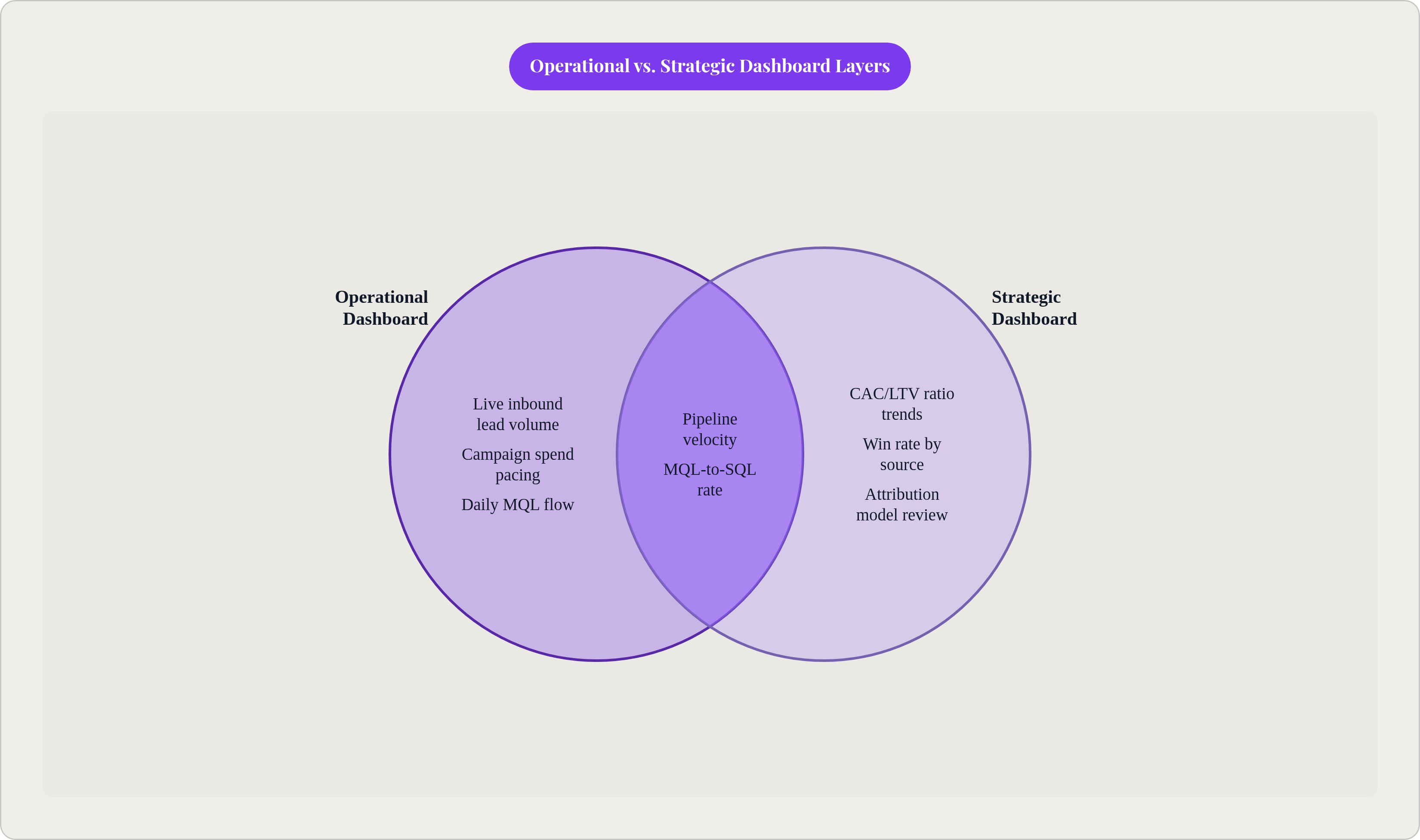
Build for both uses explicitly. The Monday morning pipeline review needs live inbound lead volume, active campaign spend pacing, and daily MQL flow. The quarterly planning session needs quarter-over-quarter pipeline velocity trends, win rate by source over a rolling 90-day window, and CAC movement against LTV. One undifferentiated report serves neither audience well, and usually ends up serving neither at all.
Embed the dashboard in existing routines rather than creating new ones. Adoption is a scheduling decision as much as a design decision. A dashboard reviewed in a standing weekly meeting gets used. One that lives in a tool people have to consciously navigate to, separate from their normal workflow, does not.
The RevOps Function That Keeps a Shared Dashboard From Drifting Back Into Silos
Revenue Operations is the function that owns the single source of truth: one plan, one dataset, one process connecting marketing, sales, and customer success. Companies with a formal RevOps function consistently report stronger revenue growth and profitability than those without. The function is structural, not optional.
What RevOps actually does for the dashboard is specific. It owns metric definitions and enforces them when systems or processes change. It audits data quality on a regular cadence, not just at build time. It manages the closed loop technically, ensuring the CRM, marketing automation platform, and analytics tools stay connected so closed deals flow back to marketing attribution and marketing engagement data flows forward to sales reps. And it decides when a metric should be retired, redefined, or replaced, then gets both teams to agree before the change goes live. That last part is where governance breaks down most reliably without dedicated ownership.
The failure mode without RevOps is fast and predictable. Dashboards are built, definitions drift as teams update their systems independently, and within a quarter the numbers in the shared view no longer match what either team sees in its own tools. Trust collapses. The dashboard is abandoned. Teams revert to separate reports. The whole exercise repeats itself in six months, usually with a different tool purchased to solve the same underlying problem. It is the organizational equivalent of rearranging deck chairs — except the ship is made of spreadsheets.
The Review Cadence as Governance
The cadence of review is a governance mechanism, not a scheduling convenience. A weekly operational review covers pipeline velocity, MQL-to-SQL conversion, and active campaign performance; decisions get made or escalated here. A monthly alignment review covers win rate by source, marketing-sourced pipeline percentage, and sales cycle trends, with both team leads presenting, not just RevOps. A quarterly strategic review covers CAC/LTV, attribution model accuracy, and definition audits, which is where the dashboard itself is evaluated rather than just the numbers within it.
The discipline for RevOps is not building more dashboards. The average RevOps team maintains far more reports than anyone reads. The discipline is fewer dashboards, tied to specific decisions, delivered to the right audience at the right cadence.
For teams without a dedicated RevOps function: assign explicit ownership of the shared dashboard to a named individual or small working group drawn from both teams. Ambiguous ownership is the fastest path to an unmaintained dashboard. Someone's name has to be on it.
A Practical Sequence for Building the First Version
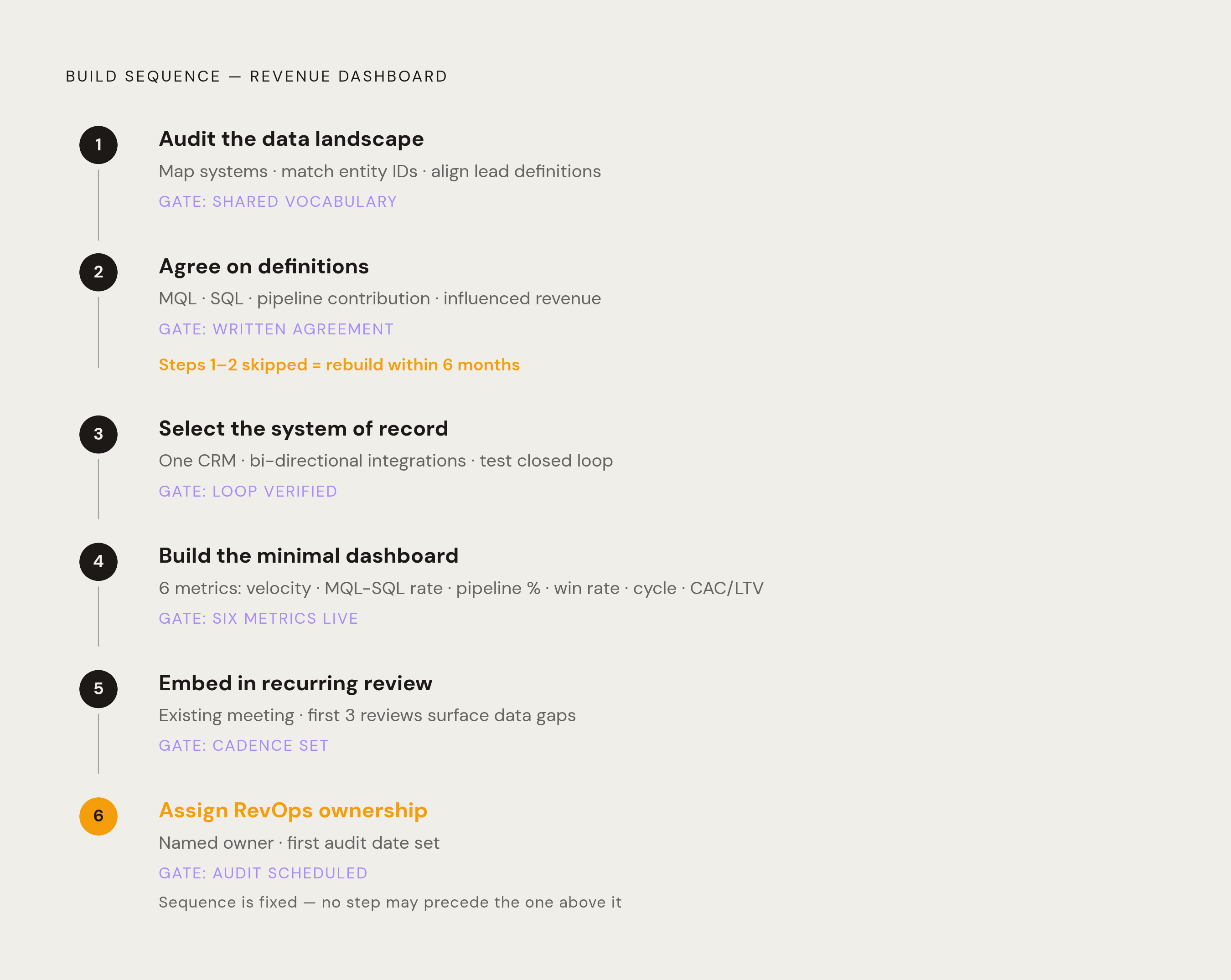
The sequence matters more than the tool. Teams that jump to tool selection before completing the first two steps almost always rebuild the dashboard within six months, because the tool is not the hard part. The hard part is everything that precedes it, and skipping it does not save time; it relocates the cost to a point downstream where it is more expensive and more disruptive to fix.
Step 1: Audit the current data landscape. Map which systems hold which data, covering the CRM, marketing automation platform, ad platforms, web analytics, and product data if applicable. Identify where the same entity, whether a contact, account, or opportunity, lives under different IDs in different systems. Pull the current definition of "qualified lead" from marketing and from sales separately, then compare them. The gap between those two documents is the scope of the alignment work ahead.
Step 2: Agree on definitions before touching tooling. Jointly define MQL, SQL, pipeline contribution, and influenced revenue, along with any other term that will appear in the dashboard. Document the agreed definitions somewhere both teams can reference on demand, not in a slide deck from a meeting six months ago that nobody can find. These definitions are the foundation. Everything else sits on top of them.
Step 3: Select and configure the system of record. Before any dashboard tool is chosen, confirm that a single CRM will serve as the authoritative source for all commercial data. Configure the integrations between that CRM and marketing automation, ad platforms, and analytics tools so data flows automatically in both directions. Test the closed loop before building anything on top of it.
Step 4: Build a minimal first version with the six core metrics. Resist the instinct to build everything at once. A first version that includes pipeline velocity, MQL-to-SQL conversion, marketing-sourced pipeline percentage, win rate by source, sales cycle length, and CAC/LTV is complete enough to be useful and simple enough to be trusted. Add complexity only after the team has demonstrated it consistently uses the simple version.
Step 5: Embed the dashboard in a recurring review. Schedule it into an existing meeting in the first week, not as a new meeting but as a standing agenda item in one that already happens. The first three reviews will surface data quality issues, definition gaps, and missing integrations that were invisible during the build. This is expected. The review cadence is how those issues get diagnosed and corrected before they become reasons to abandon the whole thing.
Step 6: Assign RevOps ownership and set the first audit date. Before the dashboard goes live, document who owns it, what the quarterly audit process looks like, and under what conditions a metric gets redefined or retired. Set the first audit date on the calendar before the first review. Governance does not begin after the dashboard is stable. It begins on day one, because instability is exactly when it matters most.
The dashboard makes misalignment visible and measurable. That is its value. Not that it resolves the underlying tension between teams, but that it strips away the ambiguity that lets the tension go unaddressed indefinitely.